
CASE STUDY
•
CHARITY
•
2024
Action for BPAN - building the UK's first website for a rare-disease cure.
A small charity, a vast research mission, and three jobs the site had to do at once: drive donations, rank for searches that barely exist, and stay accessible for the families it serves.
Action for BPAN
CLIENT
UX Consultant
ROLE
UX/UI, Brand, Build
DELIVERABLES
2024
YEAR

OUTCOMES
#1
Google ranking for "BPAN charity UK" within 2 months of launch
AA
WCAG 2.1 accessibility compliance across every page
+700
'Donation' button clicks in the first 6 months
+£200k
Raised in donations since the website's inception
01
The Problem
BPAN — Beta-Propeller Protein-Associated Neurodegeneration — is a rare and devastating disease. Awareness is the bottleneck for funding, funding is the bottleneck for research, and research is the only path to a cure. The charity had a mission. It needed a digital front door.
Three demands sat on the brief: rank highly in UK charity search results, present complex medical information without overwhelming, and remain fully accessible - because many of the people interacting with the site are caring for children with severe special needs.
02
Approach & trade-offs
Benchmarking against leading UK charities established the conventions worth keeping and the ones worth breaking. Information Architecture was the spine of the project - every piece of content was placed against the question "who is reading this, and what do they need to do next?"
"Accessibility isn't a compliance checklist. It's the difference between a parent finding information at 2 am and giving up."
- JOE SAYERS, UX CONSULTANT


03
Three decisions that shaped the flow
01 - Donate and Support placed front and centre
The whole site funnels to two actions. No third option, no "Learn more" CTA softening the choice, no donation amount picker pretending it's a form. Custom HTML buttons with subtle motion, placed at every natural decision point in the read. Two CTAs only - Donate and Support - to keep the choice architecture clear. Awareness funnels to action; action is never more than one tap away.
02 - Designing for the 3 am visitor, not the 11 am one
Two audiences come to a rare-disease charity site, and they need different things. Fundraisers and journalists search during working hours, looking for facts, mission statements, contact details. Parents and family members search at 3 am, looking for reassurance, plain-language explanations of symptoms, and signs that they aren't alone. Both have to be served - but only one of them can lead the homepage. I built the site around the 3 am visitor. The fundraiser still finds what they need; they just find it a click deeper. The parent finds what they need immediately, which is the harder problem and the more important one.
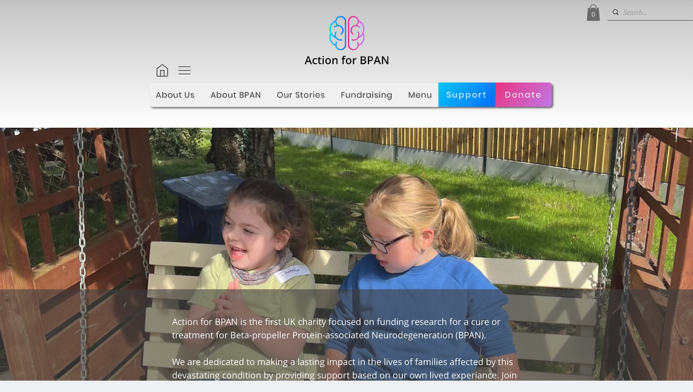
03 - Brand-led hope, not stock photo grief
Most rare-disease charities default to a muted, clinical palette and photography that signals seriousness through sadness. The Action for BPAN logo was already bright and hopeful; I built the system around it rather than softening it. The colour scheme carried emotional weight through the whole site without a single sad-child stock photo. Hope, not grief, was the editorial line - both because it serves the families better and because it works harder for donations.
04
The result
Hopeful, accessible, and the first result anyone searching for BPAN in the UK now sees. The site at actionforbpan.co.uk is live and accepting donations.


05
Reflections
This project was very personal to me. In 2020, my eight-year-old niece Emily was diagnosed with BPAN. Action for BPAN is the first UK charity dedicated to funding research towards a cure, and I'm proud to have built its first website. If this work resonates and you'd like to support the cause, please visit actionforbpan.co.uk.